Which AI image generator can actually spell? We ran a test
- We gave three AI image generators, Google's Gemini, the OpenAI image model we run through a tool called Codex, and xAI's Grok, the same design brief for each picture, including an exact headline to print on it.
- The tools that rendered only the words we supplied spelt the headline correctly and looked clean; the ones that added their own labels tended to misspell, garble or invent text.
- Across three example stories, Gemini and Codex stuck to the brief, while Grok often had the best colours but plastered on words nobody asked for, from stray "REVIEW" stamps to made-up dates.
- This was a quick internal comparison judged by eye, not a scored benchmark; the useful lesson is what to test when you pick an image tool of your own.
Ask several AI image generators for the same picture, with the same headline printed across it, and the thing that separates them is not artistry. It is spelling. In a small internal test we ran this week, the tools that quietly stuck to the words we gave them turned out clean, readable images, while the ones that felt free to add their own text got into trouble fast: misspelt words, invented labels, the odd giant letter drifting in from nowhere.
We do this a lot. Every report and blog post on this site gets a bold, headline-led picture at the top, generated in a consistent house style rather than pulled from a stock library, and we have written before about how that image pipeline came together. So when a few new image tools became options, we wanted a like-for-like look before trusting any of them with real posts. Nothing fancy, just the same job given to each and an honest look at the results.
How the test worked
For each picture we wrote one brief and handed the identical brief to every engine. A brief has three parts: an exact headline to render, a creative direction such as a pop-art screenprint or a chalk-on-blackboard look, and a short colour palette. Then we judged four things by eye. Did the headline come out word for word, and correctly spelt? Did the colours match? Did the style match the direction? And, the one that trips these tools up most, did the engine invent any text we never asked for?
We compared three engines: Gemini, the OpenAI image model we drive through a command-line tool called Codex, and xAI’s Grok. One small note for anyone keeping score at home, we reached Grok two ways, through xAI’s own interface and through its separate Grok Build command-line tool, and both produced the same kind of result, so we show a single Grok picture per story below.
Three examples give the flavour of it.
Australia’s AI Safety Institute, as a pop-art screenprint
The brief here asked for a bright halftone pop-art treatment in sage green, dusty rose, terracotta and cream, with the headline “Inside Australia’s AI Safety Institute”. This is the picture that ran with our post on what the Institute actually tests for, so we knew what a clean version looked like.
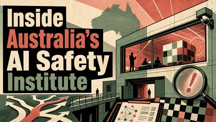 Gemini: clean halftone, only the words we asked for.
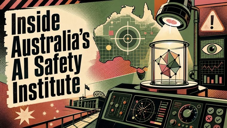 Codex: headline exact and no invented text, though it leaned more towards a retro editorial print than a comic-book pop-art look.
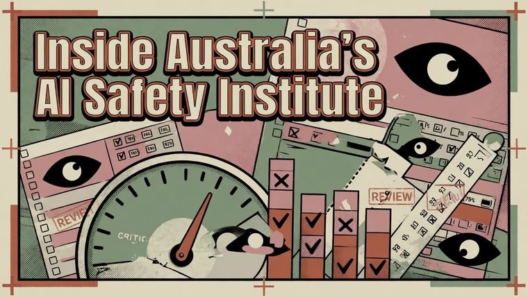 Grok: arguably the best colour match of the three, and completely undone by text we never briefed, stray “REVIEW” stamps, a “FAIL”, floating percentages, the word “CRITIC” on a little gauge.
Gemini and Codex both did the job. Grok made the most eye-catching image in the row and then wrote all over it, which is exactly the failure that makes a picture unusable when the whole point was to carry one specific line of text.
A Brown professor’s exam story, as an editorial collage
Next, a torn-paper editorial collage in ink blue, burnt orange and off-white, carrying the headline “Do in-person exams stop AI cheating”. That story, about a professor bringing back the in-person final, was a harder brief because a collage naturally wants scraps of paper with writing on them, and writing is where these tools wander.
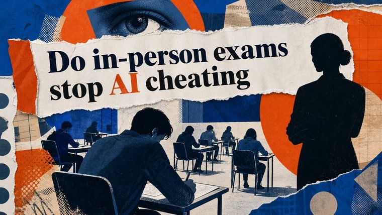 Gemini: a polished collage with the banner spelt correctly.
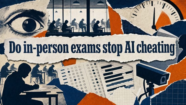 Codex: excellent collage craft, the headline exact on a torn banner, and the bubble sheets and redaction bars kept abstract enough not to spell out anything by accident.
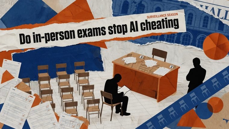 Grok: the headline came out right, but a stray half-word, “HALL”, turned up on a newsprint scrap along with faint fake text on the scattered papers.
This was the closest row. Grok’s result was usable with a squint, which shows the difference is not that one engine can draw and another cannot. It is discipline about text.
An AI news briefing, as a chalkboard
The last brief asked for a chalk-on-blackboard classroom look in aubergine, blush and muted gold, headed “AI News Briefing July 5 2026”. Here even our own baseline had a small wobble, which is the honest part of running a test like this.
 Gemini: a clean, correctly spelt headline, but it drew recognisable HP and OpenAI logos and a chalk brain doodle, none of which we asked for and the last of which we actively try to avoid.
 Codex: the strongest picture in the whole test. Hand-lettered headline exactly right, rich chalk doodles, palette on brief, and not a single invented word.
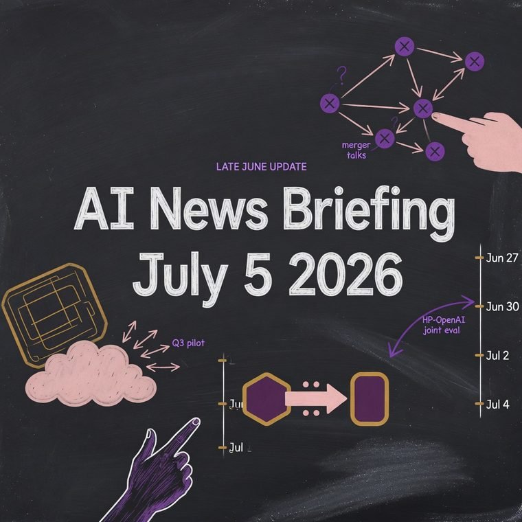 Grok: the headline was correct, then it added a spray of labels nobody wrote, “merger talks”, “Q3 pilot”, a run of dates, two of them chopped off at the edge.
What we took from it
A pattern held across all three. The engines that render only what you ask for, Gemini and Codex, almost always got the headline right and left it at that. The engine that likes to volunteer extra text, Grok, frequently produced the boldest, best-coloured image and then buried a good picture under words it made up. That is not a knock on its artistic range, and on colour it often won, but a headline picture lives or dies on getting the headline right.
If you are choosing an AI image tool to put words onto a picture, this is the thing worth testing yourself, and it is easy to miss. A sample gallery on a product page shows you the tool at its most flattering, usually with no fiddly text to spell. Give it your own exact headline instead, then read every word in the result, including the small print it added on its own. The tool that resists the urge to improvise is often the one you can actually use. And if you care about words appearing nowhere in the source, as we do, it is worth remembering that the prettiest render in the room can still be the one you have to throw away.
None of this settles which tool is best in general. It was three pictures, judged by eye, by one team with a particular need. But it changed how we shortlist, and it is a five-minute check anyone can borrow: same brief, every tool, then count the words that should not be there.